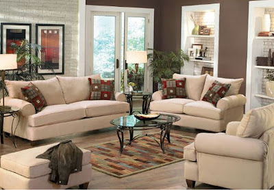
Decorating our home has become a labor of love for my wife and I. By far, our favorite room to decorate has been our living room. This space has become the centerpiece of our home, in addition to being the room we spend the most time in. We've used color, a mix of traditional and contemporary furniture, wall art, and eye-catching accessories to create a stylish living room design that is still functional and comfortable. We hope by giving you some ideas from our own living room we'll spur your creativity and point you in the right direction to making your living room your favorite room. Paint When we moved into our house, the walls were off-white. Not bad, definitely versatile, but not for us, and definitely not for our furniture and accents. We used our favorite wall color, Sherwin Williams Latte , and...WOW!!!! The room just popped! When your paint colors complement your furniture and accents, and your furniture and accents complement your paint colors...you win. Your style starts working for you. Maybe you live by the water and nautical fits your style. In that case, blues, whites, greens and yellows may work for you. If you live in a downtown loft, you may want an industrial look with white and silver elements. If you're in search of the perfect country look - try some softer, blues, reds, browns, and maybe some yellows. We choose a neutral color scheme for our living room. Brown is Jen's favorite color and I love all the tones and colors you can mix into a neutral scheme - like red, gold, bronze, maize, and orange. Next we're going to mix in a bit more black. After the color was set, we had to think about what to put on these walls... Wall Decor Just so happens that in one of our previous homes, the walls were about the same color. It was time to sell and there was this empty space above the mantle. What would be just right there? Wrought iron? Something black and white? Some professional wall art? We had the color scheme...our favorite latte, a little red, a bit of of gold...we knew the size...then we saw it in the framed art and wall decor section at Kirkland's. The frame was the perfect thickness...the colors were just right and the size looked like it would fit pefectly above the mantle. Sometimes you just have to go for it. With all the online resources these days, it's really easy to find pieces that go with your colors, before you even leave the house.
Lighting When it came to add lamps to our decor, we had to figure out the answers to some pretty important questions. Where was our primary light source? For us it was recessed lighting over the mantle. In other words, not alot! Did we want to separate a TV watching area and a reading area? Not really, because there just wasn't enough room. What kind of lighting did we want to use? Add a light to the ceiling fan - table lamps - floor lamps? Eventually we combined table and floor lamps with a style somewhere between mission and contemporary. Believe me, these two styles go together better than you might think. Furniture Our living room has two focal points, the fireplace and our TV armoire. Unfortunately, the armoire ended up next to the fireplace, simply because of the cable jack. It does work there quite well, but ideally we would have liked to move it around to some different places to get a feel for where it worked best. Just goes to show you that sometimes you have play the hand you're dealt. As for the rest of the room, our favorite piece is our sofa table. It's not behind the sofa, though. We use it as an anchor piece against one of our walls. There are lamps on both ends and it's filled with photos of both our families. It's always a great conversation starter.


No comments:
Post a Comment